
[ A GRAPHIC DESIGNER ]

LUCIAN BERNHARD
Typographer Book
Typography 1 | Spring 2018
Lucian Bernhard was a successful typographer assigned to me out of a list of skilled individuals. The objective was to create a book representing his life and achievements, but also showcase his incredible Bernhard Modern font. His type expresses a fluid and whimsical feeling, so I decided to create a book revolving around those concepts. Art that is swirly and fluid across the page is also very fun to work with, so I was happy to incorporate his type into this style.
Sketches
Due to the curved serifs mainly seen on the letter "R" of the Bernhard Modern font, I was inspired to create a design with multiple curves and swirls mimicking the letters. I also wanted to keep the design in between whimsical and formal to create a nice balance throughout the book.


Colors and Font
Creating the graphic elements for this book served as starting point to it's overall direction, but color implements a strong mood as well. I first began to look at some of Lucian Bernhard's art pieces and the color schemes he used for each design. It appeared that dark colors mixed with bright warm colors was his specialty, so I experimented with some of these by bringing the exact color into my designs.
The font used for this project was Bernhard Modern to honor what the book is about.

C
M
Y
K
33
94
73
42
C
M
Y
K
53
76
71
75
C
M
Y
K
9
17
9
0


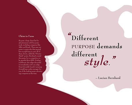
The Design
Sticking with the same whimsical feeling throughout, I made sure each page had curvy forms to relate with the type. The construction of this book was made in accordion-style, meaning each page connected to the next via fold. I decided to try and connect the pages to make the book seem like one large art piece when opened. I did this using a mixture of dark and light graphics that served as the "ground" or "sky" as The Nightmare Before Christmas reminded me of.
After these graphics were set into place, the text was all arranged on a grid to create uniformity in the book. Pull quotes were also placed in different styles to express importance and uniqueness on the pages in a more artistic way.


Finished Book
The finished book was created using only the Bernhard Modern typeface to demonstrate the importance of it's creator, Lucian Bernhard. The pages were printed on 28 lb. paper, then glued onto a Burgundy textured Canson paper to match the book and ensure longevity.
