
[ A GRAPHIC DESIGNER ]

MARIJUANA RESEARCH
Marijuana Research
Graphic Design 3 | Spring 2019
This entire Graphic Design class was one large case study project, and the challenge was to choose a subject you're interested in, but don't have much knowledge about, and create a poster, magazine spreads, and a website about the research conducted.
I decided to research marijuana and the health pros and cons. I have never even consumed the plant, so I thought it would be interesting to take a controversial topic and give an honest, unbiased presentation of it while teaching people about it's science and anatomy.
Sketches
The final project definitely changed from the initial sketches, but I needed to figure out how to organize all of the research I did and how it would fit in different layouts.
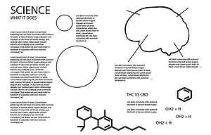
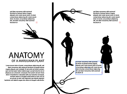
For the magazine spreads, I wanted to focus on the anatomy, science, and usage of the plant on three different spreads. For the poster, I wanted to show the most common misconceptions versus the truth. The webpages feature a more in-depth study on the magazine "science" page, giving a more interactive feel, a recipe page for "munchies" and usage for the plant.


Colors and Font
For the colors, I tried to keep them light and fun, but also the colors of the marijuana plant. I went with a black background for most of the project to make the colors pop.
For the font, I chose Pepperoni Pizza, Congratulations, and Single Sleeve to continue the fun learning vibe of the project.


The Design
The entire project design revolved around the design of the poster as this was done first. I used a dark background and bright colors against it to show importance. The text is all white. For the magazine spreads, I continued the same theme as the poster, but included a lot more information. There are also more photographs in the spreads. The website pages have a more light background, but continue that same friendly vibe.


