
[ A GRAPHIC DESIGNER ]

FARMISH
Farmish Kitchen Products
Packaging Design | Spring 2019
Farmish is a family-owned company that creates high quality products for the entire home. The term "farmish" relates to the "language" farmers speak to one another containing words ordinary people have probably never even heard of before. This brand supports the lifestyle and aesthetics of the farming community, cherishing their heartwarming country style. The idea behind the brand as a whole is long-lasting products that can be passed down to generations, with short-lasting packaging that is biodegradable containing seeds.
Sketches
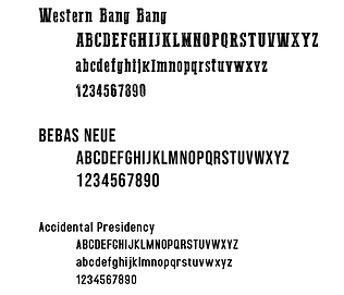
My initial sketches revolved around the typography of farm and country living first. Once I decided on the type and combination of the different typefaces together, I went on to create the graphics as well.
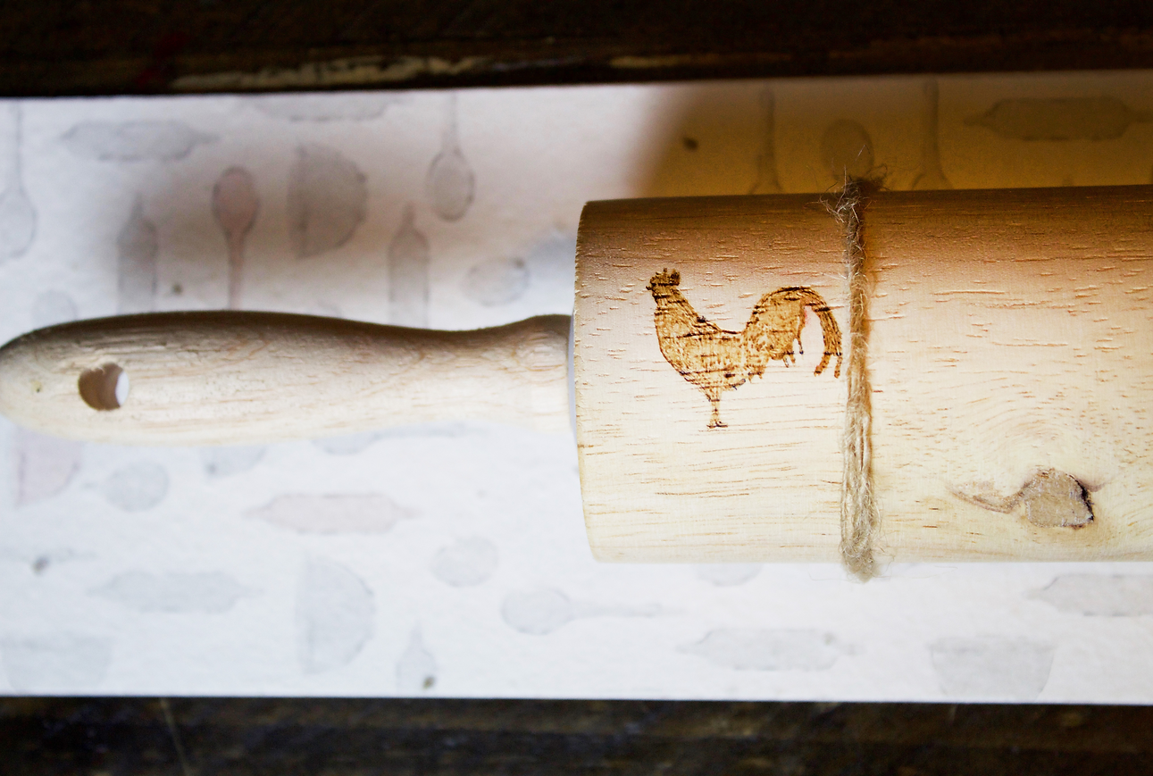
A simple vectorized rooster stands tall as the logo for this brand as it is a common figure known worldwide as a farm animal.


Colors and Font
This project was a bit unusual when it came to color. I wanted to make this brand as sleek as possible, so i opted for the least amount of color possible. I used burgundy for the differentiation of the kitchen products and a darker teal for the bath products. I relied on the light cream and mint colored paper to give me small amount of color needed.

C
M
Y
K
33
94
73
42

The Design
For the design of these products, I wanted to keep that country feel, but also keep it very light and simple. I focused heavily on Farmer's markets' style for inspiration.
The main logo is a plain vector rooster that continues the simplistic country vibe.
Black strokes throughout the packaging help enunciate certain elements and words, also acting as barrier for the pattern and font to not interact and become scrambled.
The texture of the seed paper also came into play here as without it, it might not have that country-feel.


Finished Products
Finished products were printed via inket on specially crafted paper inlined with tomato seeds. Each package was reinforced somehow either by folding or gluing the paper together as it was somewhat flimsy. The logo is either wood burned or painted on each product.
