
[ A GRAPHIC DESIGNER ]

MEILI
Rice Boxes
Packaging Design | Spring 2019
Meili rice began as a way to show the beauty of China and the variety of beautiful landscapes it holds, through food. Rice has been the staple for China for centuries, and continues to be recognized as one of the most popular foods to eat to this day. With Meili rice products, you are able to see how we should cherish our food, and see the beauty behind the country it comes from. All rice products are grown naturally in the beautiful terraces of China, making it highly authentic.
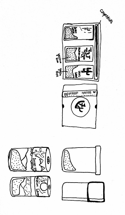
Sketches
For my initial sketches, I wanted to mimic a Chinese takeout box with a window on the front to display the rice. I even thought it might be fun to fasten the top of the lid together with chopsticks to make it look more unique. I also first thought to use the word "rice" displayed in Chinese characters on each box as the main focal point.
Later renditions, though, included taller boxes each with it's own picturesque front displaying the different seasons of China.
Colors and Font
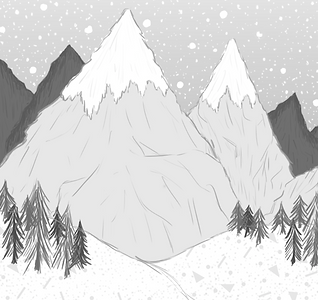
The colors I used for this project revolved strictly on the different geographic locations and their seasons in China. For example, the wetlands and plateaus are represented with green, the high mountain ranges are usually covered in snow so that box is primarily white, and the vast desserts are obviously an orange sandy color. Fonts used were Skia and Kill the Noise.


The Design
Like mentioned previously, the idea for these boxes revolves around the different and unique geography of China. For all of the boxes, I initially had only vector imagery, but later combined vectorized images with hand drawn lines to mimic the ancient Chinese drawings. The "Meili" logo is a big focal point right at the center of the box. The word stands for "beauty" in Chinese, which is what I'm trying to convey through these boxes.


Finished Boxes
The finished boxes were printed on 60 lb. paper, then glued onto 100 lb paper to ensure their structure stayed intact.
